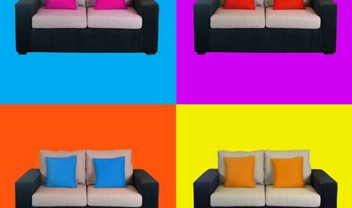
Pop colors have seen a resurgence in recent years, and are finding their way deeper into interior design. These colors are a type of vibrant shades that are put on a minimalist or white background to allow them to stand out. When used correctly, pop colors provide a retro look that doesn’t require the entire room to be completely redesigned.
Incorporating Pop Colors in Flooring
Perhaps one of the best places to incorporate these colors is in your flooring. To do this, you must understand the attributes of each color, and when and where each color should be used. Once you have this knowledge you can create dazzling interior designs that will charm everyone who sees them.
Yellow
Yellow has experienced a renaissance within interior design over the last few years. The most popular shade right now is mustard, and when added to your floor yellow provides arguably the boldest and most vibrant statement.
One of the top combinations for flooring is combining yellow with grey, as both colors complement each other. This combination is popular for kitchen floors.
Orange
Orange is a very rich color that is known for its deep tone. However, it can be somewhat restrictive when used in flooring. For instance, orange doesn’t work well with certain woods such as oak or those which are reddish in color, as it will clash with them.
Orange works best when it is combined with cooler shades and designers have found success by adding it to walnut or lime oak.
Teal
Teal is a strong color, so much so that it can completely alter the look of a room. However, it can be subtle, and its pops tend to be dramatic. When teal is combined with lighter shades it will generate a calm feel.
When used with a blue tone teal is perfect for ashen floors, and works well with woods such as Smoked or Limed Oak. However, teal is versatile and can also be combined with darker shades such as Dark Sawn or Ebony, which will give the floor a regal appearance.
Coral
Coral provides a tropical feel and has experienced its own resurgence in 2016. It is the perfect color for contemporary flooring that has an exotic look.
However, because the color consists of orange and red tones it can be challenging to pair with other colors and textures.
Coral works well with dramatic and dark colors, and while it should never be combined with classic oak it works well with woods such as Walnut, Distressed Acacia or Olive Wood. It is best to use Coral once within a space and as a focal point, which is why some interior designers use it on rugs.
Pop colors are here and they will be around for a while. When used properly they can easily lift the vibe in the surroundings, and orange and yellow will be defining colors to watch for this year.
Coral and teal will be used in ways that are rarely seen and will give interior and flooring designers more avenues for exploration.

